Q&A with LAIKA/house Director Aaron Sorenson
By Alise Munson
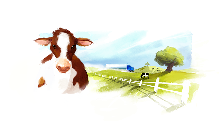
 This week, three new spots for Kraft Singles aired on broadcast and online outlets. To echo Kraft’s dedication to eliminate artificial preservatives and flavors from Kraft Singles slices, Chicago advertising agency mcgarrybowen worked with our Director Aaron Sorenson to visually represent the appeal of natural foods. The result was an innovative mix of stop-motion and 2D animation techniques that give movement to an adult storybook illustration style. Take a look at how the spots were made, the design choices and the narrative built for this campaign. Aaron and Artist/Designer Alan Cook expand on the journey.
The final spots: Make Something, No Artificial Preservatives, and Tasty Ending.
Q: What approach did you pitch to Kraft Singles and mcgarrybowen?
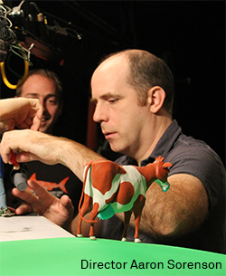
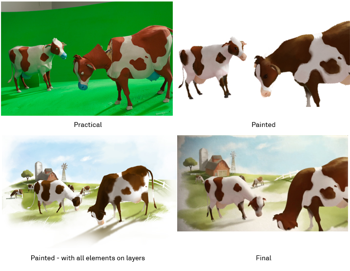
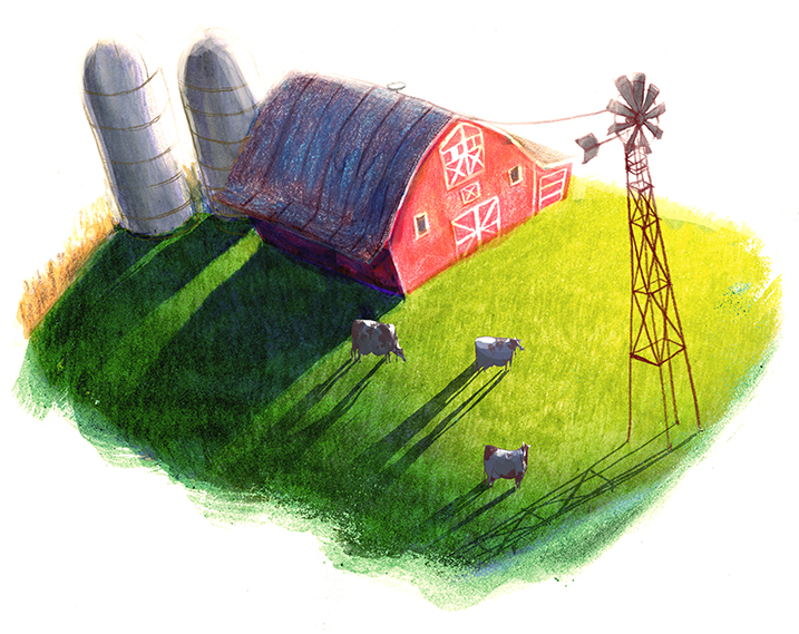
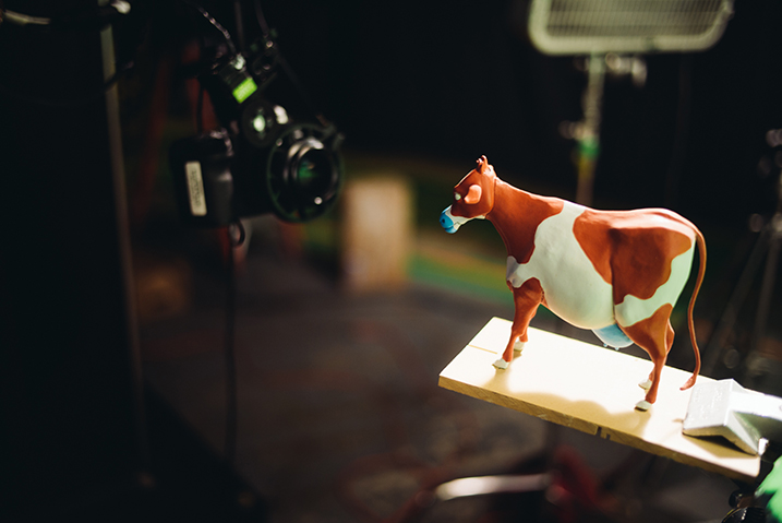
Aaron: The appeal of our narrative and our look is based in a handcrafted simplicity. To support the statement “nothing artificial,” we created a truly handmade series of commercials combining practical elements, stop motion and hand-rendered painting. Our approach started in the dimensional world with the fabrication of key practical pieces such as cows, barn and a milk truck.... We set up our scenes and animated these elements in stop motion to form a firm foundation—a rather simplified base layer that gave us real-world information about movement, light and shadow. The next step was frame-by-frame hand painting, which we overlaid on the photographed animation. Here, we developed the details—allowing some of the stop motion to mix back into the painted image and merge dimensionality with textural nuance.
Q: What direction did you take in the design?
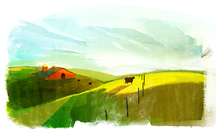
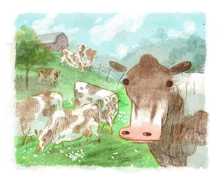
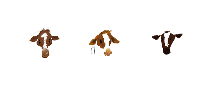
Aaron: These spots called for a simple watercolor or gouache paint style. I wanted a style that felt spontaneous and unlabored with a minimalist sophistication. Also by its nature, there is a lightness and airiness to watercolor that felt right. The palette used warm earth tones and rich greens to tie into nature. I also knew that combining a painterly illustration style with dimensional sets would enhance the camera moves as we panned from image to image. We introduced an element of parallax to the different tableaux as the camera moved around the page to enhance the illustrative style. The animation style of the cows was restrained and specific. I wanted the final look of the cows to move in a distinctly cow-like way regardless of the stylized design. Seeing the cow’s weight in her walk, swaying from side to side as she ambles along—this gives the viewer a feeling of authenticity in the animation.
Alan: I think a hand-made aesthetic was important. Making it feel as though the image was crafted by traditional means mirrors the image of the product - that it was created in a natural way that people often respond more directly to.
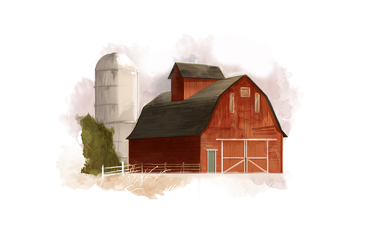
Farm Concept Art
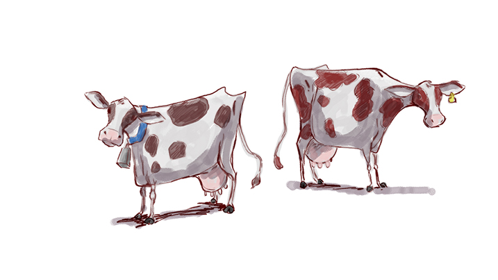
Cows Concept Art
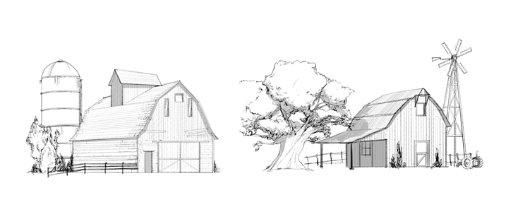
Barns Concept Art
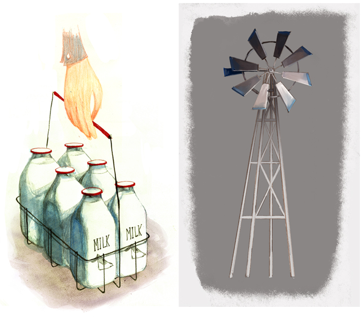
Props/Misc Concept Art
Q: The technique seems to be a custom innovation.
Aaron: It’s certainly unique; it’s actually hard to think of any other pieces of animation done exactly like this. That’s one of the great things about LAIKA/house—we have the ability to combine stop motion, traditional 2D animation, live action and cg easily and all in-house.
Alan: The best reasons to integrate the two mediums were the ability to push some of the animation itself, to do what the puppet couldn’t actually do, and the ability to read and use the shadow and highlight information from the actual stop-motion shot.
Q: What software/tools did you use?
Alan: The main tools were Adobe Photoshop and Adobe After Effects. There were a few other 3D packages to do some other tricks with integrating it all together, but most of the work came together in the animation timeline in Photoshop. On stage, we used Dragon software to capture images.
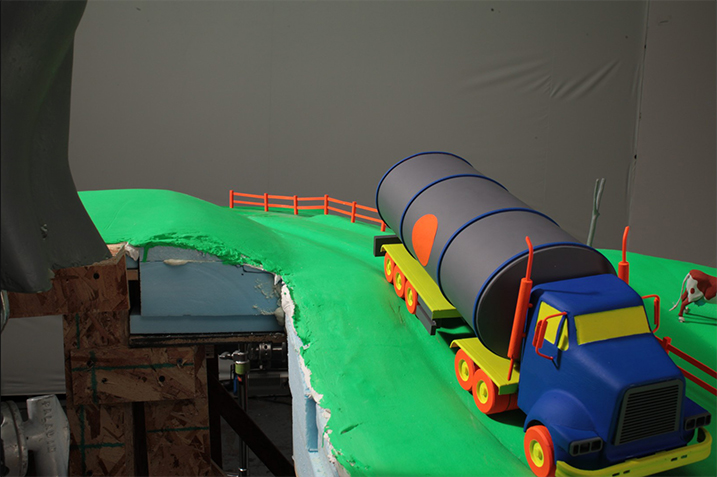
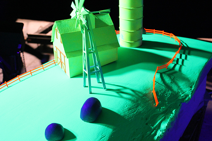
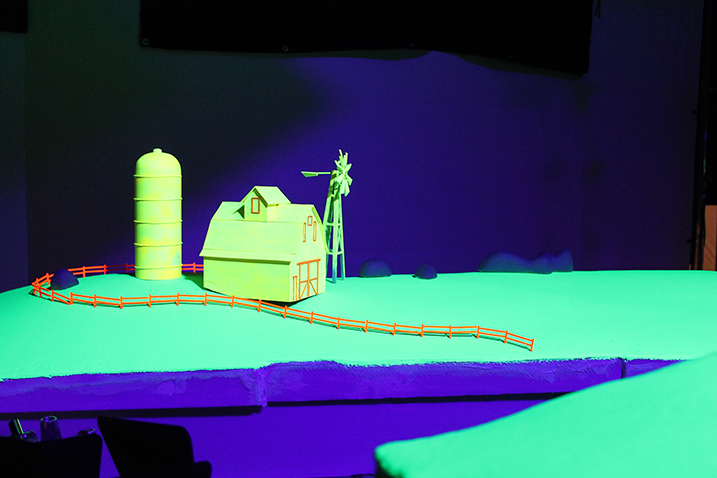
On stage: These photos illustrate the technique we used. We painted the practical puppets, props and sets in bright neon colors allowing 2D artists to easily isolate individual objects to matte and paint. Objects in the forefront, like fences, were painted orange while the grassy pasture were painted day-glo green and the barn was colored yellow.
Practical Shots on Stage
Under black light: When the black lights were turned on, each neon color popped vibrantly giving artists a more defined canvas and simpler way to isolate objects on different planes.
Q: Live action?
Aaron: Yes, the beauty shots of the grilled cheese sandwiches made with actual Kraft Singles. Mcgarrybown Creative Director Michael Straznickas brought in well-known food stylist Susan Spungen to create the perfect grilled cheese. The entire studio smelled delicious and the product shot was mouthwatering. After the sandwiches were shot, each frame of the live action was then hand-stylized to be consistent with the overall look and feel of the spot.
Videos
Each shows how the spots looked during the first phase of animation on the stop-motion stages.
The final spots: Make Something, No Artificial Preservatives, and Tasty Ending.

